Brand Guidelines & Kit
Our brand assets represent our open attention exchange for builders. Use these resources to represent BackSpin in integrations, articles, and marketing campaigns.
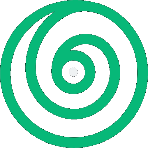
Official Logos
 Light BgDark Bg
 Light Bg
 Dark Bg
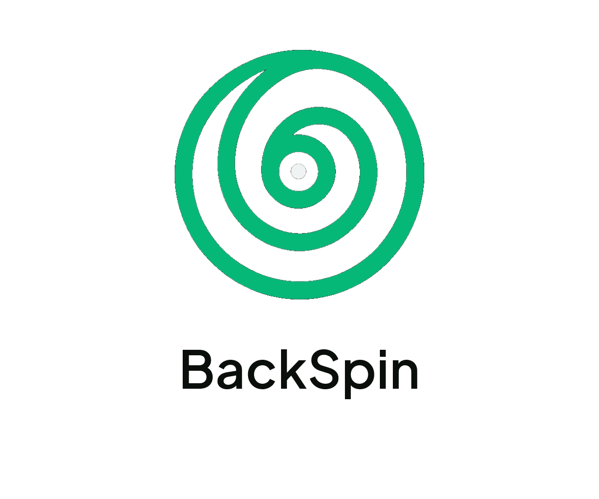
Color Palette
Primary brand logo color, accents, and success states.
Body text, display headlines, and light-theme structure.
Dark mode background, IDE cards, and terminal sections.
Soft backdrop panels, dashboards, and table headers.
Default page background, light cards, and content container fill.
Primary action highlights, buttons, and callout sections.
Typography System
Plus Jakarta Sans
Used for display titles, marketing headlines, and wordmarks. A clean geometric grotesque that gives BackSpin its open, premium feel.
Hanken Grotesk
Our primary sans font, used for all interface body copy, descriptions, forms, and secondary elements. Highly readable at smaller scale.
Web & Mobile Launcher Icons
Includes specific sizes for standard desktop favicons (`16x16`, `32x32`, `48x48`), Apple Touch Icons (`180x180`), and Android/Chrome launcher sizes (`192x192`, `512x512`).